Comatch — Redesign
European-leading consultant marketplace with over 5k monthly active users. I led design for the B2B side of the product, enabling collaboration with consultants and easy project management for corporate and consultancy clients.
Services
Product Design, Strategy
Timeframe
Jan - Jun 2020
Platform
Responsive Web App
Category
Project Management, Consulting
The Problem
What to do if users don’t use your product?
I was assigned to work on this project as we had a clear problem — poor user engagement. My role was to find out why users don’t interact with the product, define the UX strategy with the PM, decide on improvements and a new feature set, and redesign UI.
*To comply with my non-disclosure agreement, I have omitted confidential information in this case study, including specific numbers.
10x lower
User engagement of business clients, compared to consultants.
30%
Clients never logged in & handled all requests over the phone.
Together with UX Researchers, I planned user interviews and feedback surveys. During the research phase, we discovered that business users don’t interact with the app because it doesn’t support their work.
Key User Needs
Communicate with consultants to clarify any questions
Have an overview of project accuracy and budget allocation
Way to find and approve travel expenses and work activities
Fast way to access all information they need, also on the go
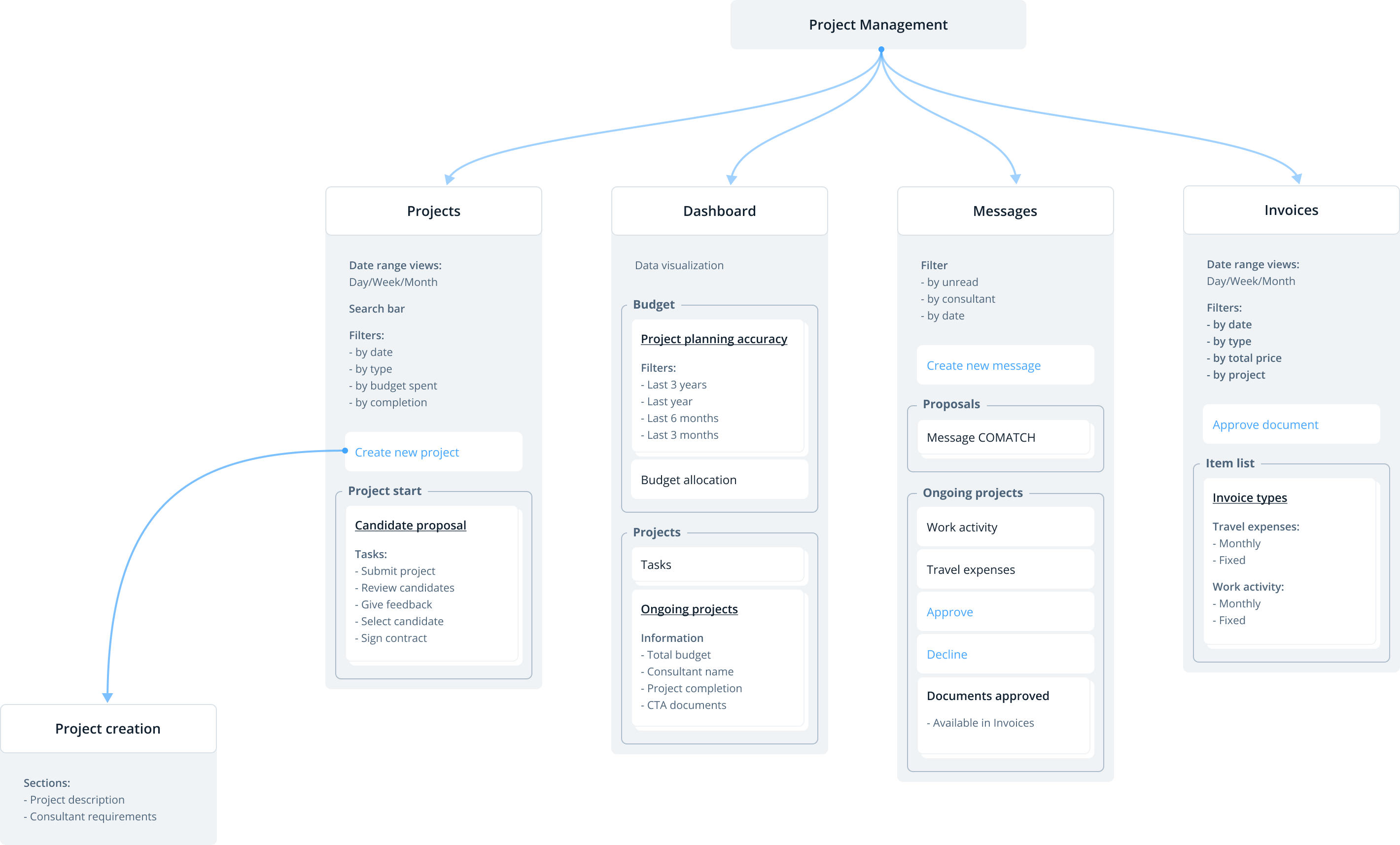
Information Architecture
The redesign of the sitemap was a starting point to create an app that supports easy project management. The focus on three points that users highlighted as most important during user interviews.
Focus on jobs to be done to set up project
Access and approve invoices
Monitor budget and project accuracy
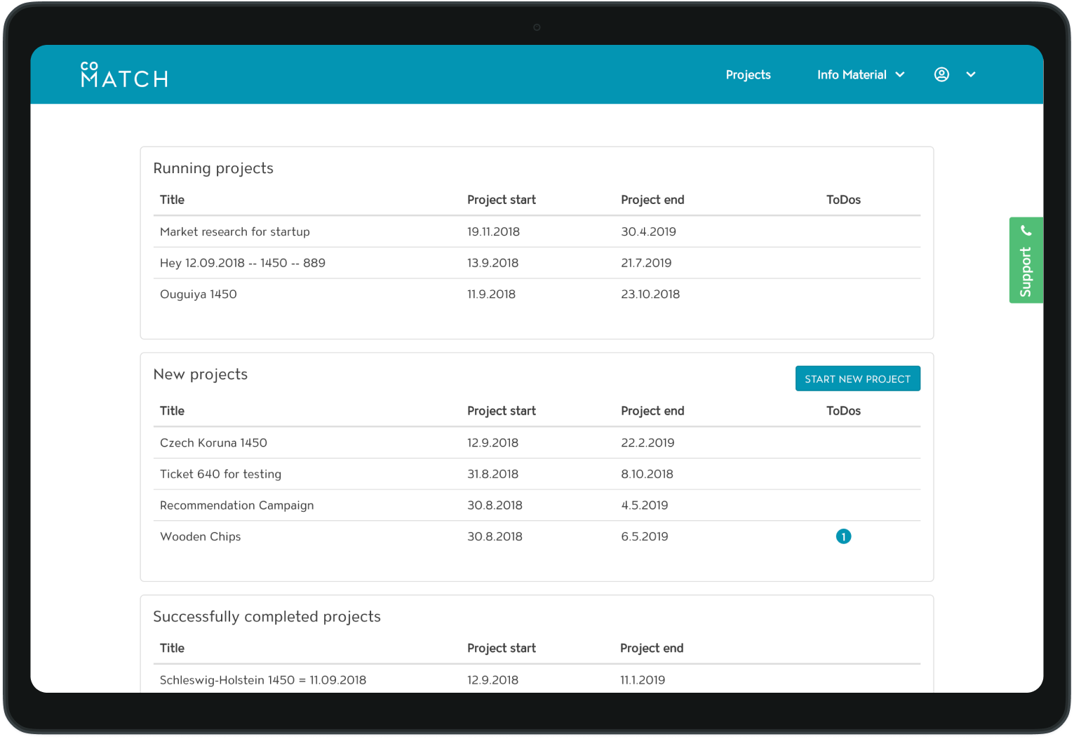
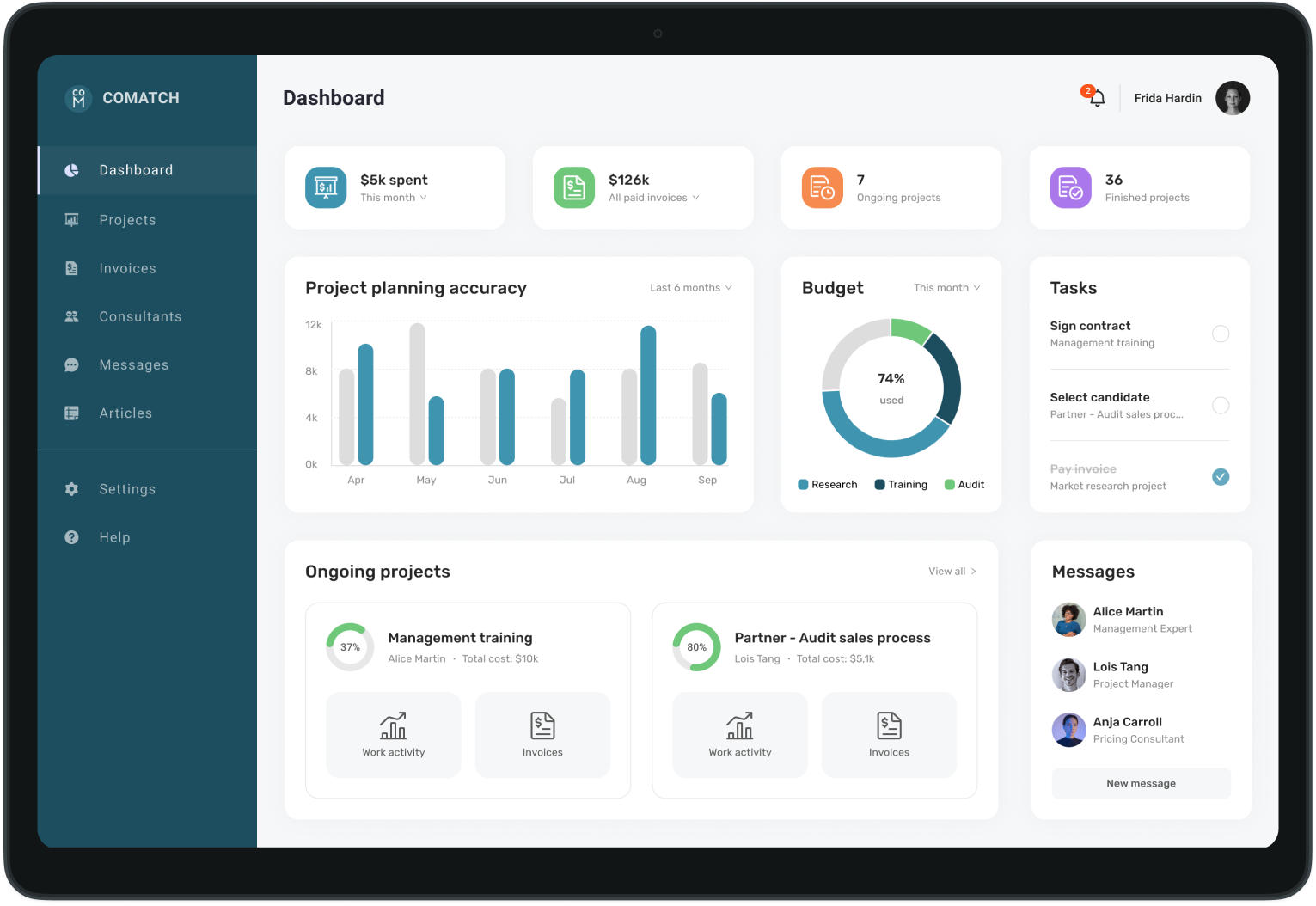
New design
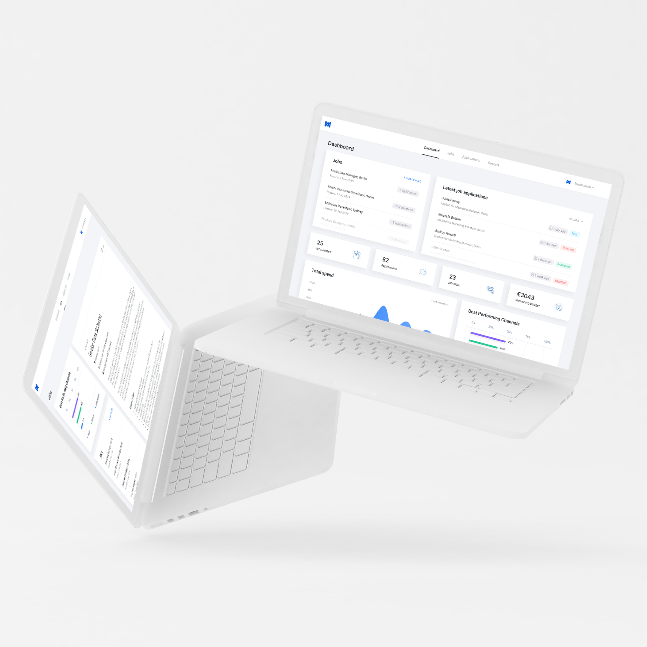
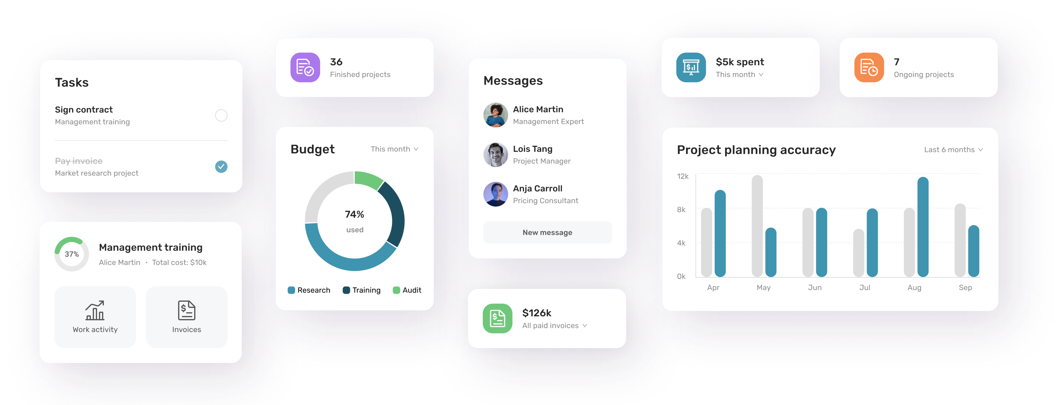
Redesigned homepage to increase user engagement
The new homepage became a dashboard visualizing data on budget, project accuracy, and tasks overview. Added in-app notifications tremendously increased engagement. I also redesigned the navigation to provide easy access to all important sections.
Before ↔︎ After
Mobile experience
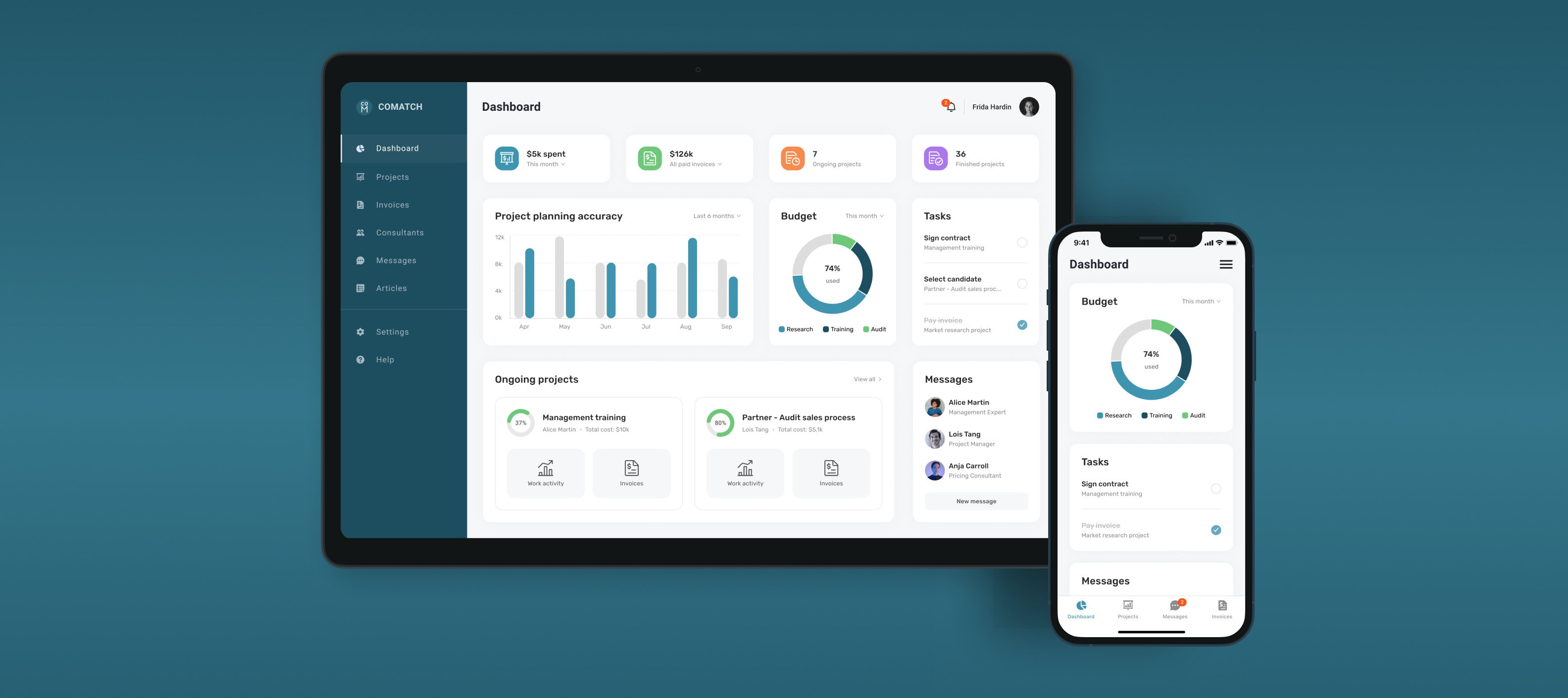
Created responsive design
Project Managers are busy and travel a lot. It was important to focus on responsive design and create a great mobile experience, so users can access and manage their projects on the go.
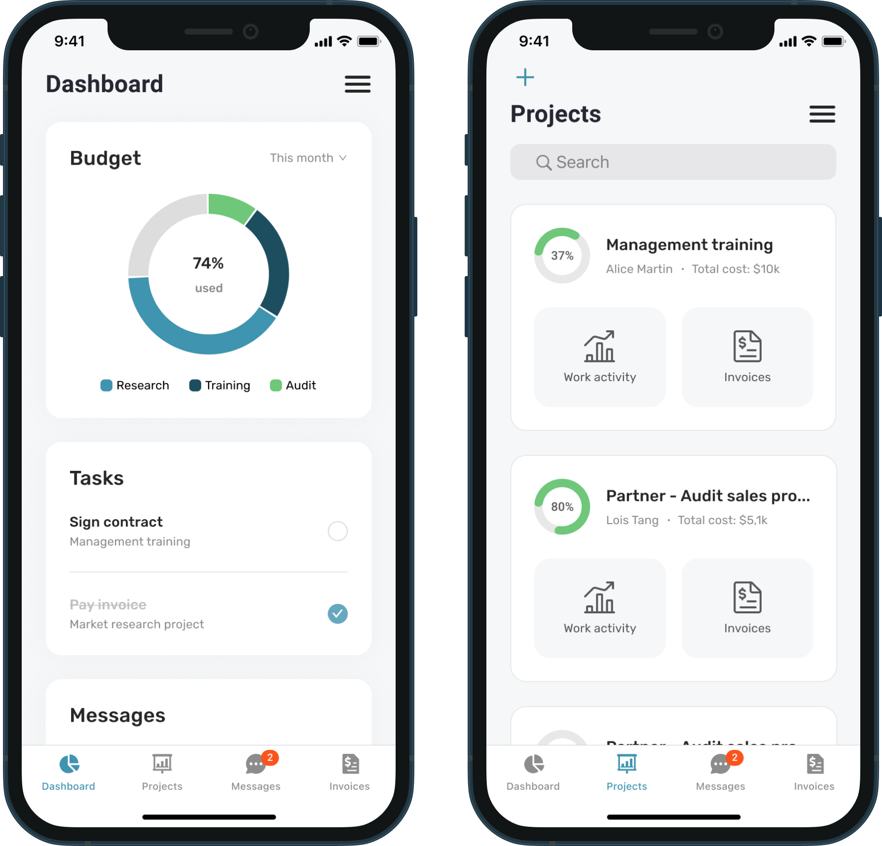
20% of the traffic before the redesign was already coming from mobile devices. Redesigned responsive app increased mobile traffic to 37%.
New functionality
Enabled easy collaboration
Comatch didn't provide an option to communicate with consultants within the app. Jumping from the app to email communication was one of the most frequently mentioned pain points. That's why I planned and designed the "Messages" feature.
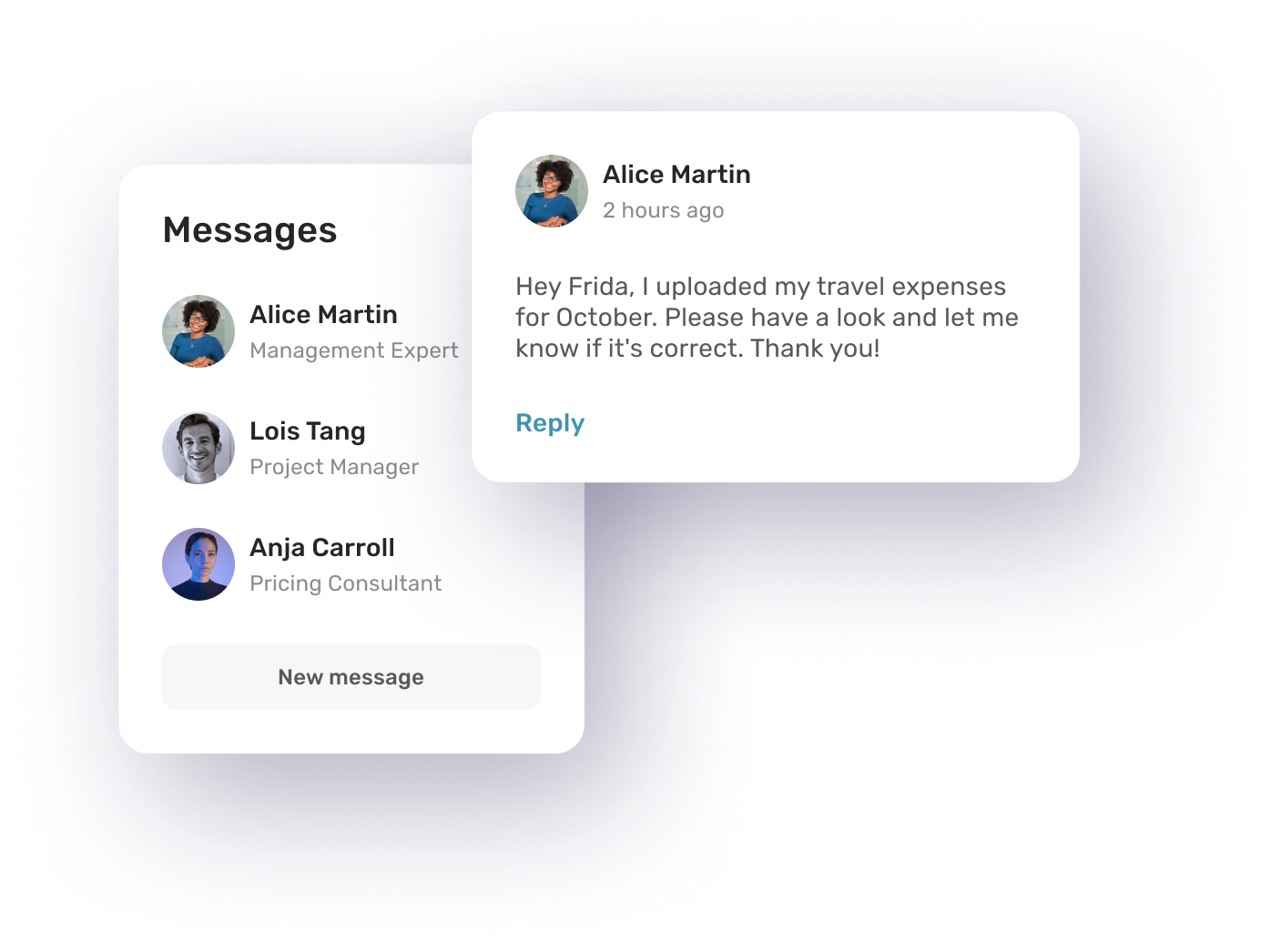
In-app messaging functionality became one of the most used features, making collaboration 2x faster.
UI Components
Added flexibility with widgets
I challenged the way information was displayed. I designed a new UI concept of modular widgets. Widgets can be dragged and dropped within the dashboard, so Project Managers can organize information in the way that fits their needs.
Learnings
- Keep the user needs and goals in mind
Always design a dashboard with user needs and goals at the forefront rather than being focused on the data being displayed. - Make the design visually appealing
A visually appealing design can help to keep the user engaged and make the dashboard more effective. - Make it easy to navigate
Any digital product should be easy for users to navigate, with a clear hierarchy and pathways for the user to follow. - Continuously iterate and improve
A redesign is not a one-time process - it's important to continuously iterate and improve the design based on user feedback and testing.
More case studies