MindMatch — Product Design
Web tool matching job offers with best-fitting candidates using AI-powered pairing algorithm. One of the biggest challenges was to create an app that fits into recruiters' workflow and supports their needs.
Services
User Research, UX/UI
Timeframe
February – May 2019
Platform
Web App
Category
Recruitment tool
MindMatch strived to create an app that fits into recruiters' daily workflow and supports their needs. The workflows might vary, and finding the solution that would work for different recruiters was a big challenge.
High-Level Goals
1. Make MindMatch easy to use for different recruiters.
2. Shorten the time spent on the first steps of the recruitment process.
3. Find a solution to support rather than disturb workflows.
My Role
Wore many hats as a designer
I worked on this project as a product designer from January to May 2019. Back then, MindMatch was a small team of seven. I collaborated closely with the founder, engineers, data scientist, and business stakeholders.
I was responsible for user research and synthesis, design explorations, prototyping, and user testing. I also tackled the UI redesign and visual improvements that resulted in creating a new style guide. I left the project after defining the final design concept and handover for engineers.
Design Process
Research
5Ws
Competitive Analysis
User Interviews
Synthesis
Personas
Journey Maps
User Flows
Ideation
Exploring ideas
Prototyping
Testing
Solution
UI Design
Style Guide
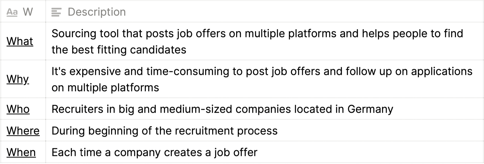
5Ws
Aligned the Team on what we build
It was tempting to jump to the user research straight away. But firstly, I wanted to find a common definition with the team of what we are building and what problems we want to solve. I ran workshops during which we defined 5Ws. We aligned on who’ll be using the product, the conditions they will use it under, business requirements, and user needs of the product.
Competitve Analysis
Found lack of transparency in competitors’ solutions
We didn’t have a PM working on the project who could do full-scale research, so I took the initiative and created a quick sprint to learn more about the market, product, target audience, and competition. The biggest finding was no transparency on where the jobs are posted.
I was also responsible for conducting and presenting UX competitive analysis, focusing on elements like usability, navigation, layout, compatibility, and calls to action. I identified underserved opportunities in the market, and spotted weaknesses in competitors’ user experience and advantages to outperform them.
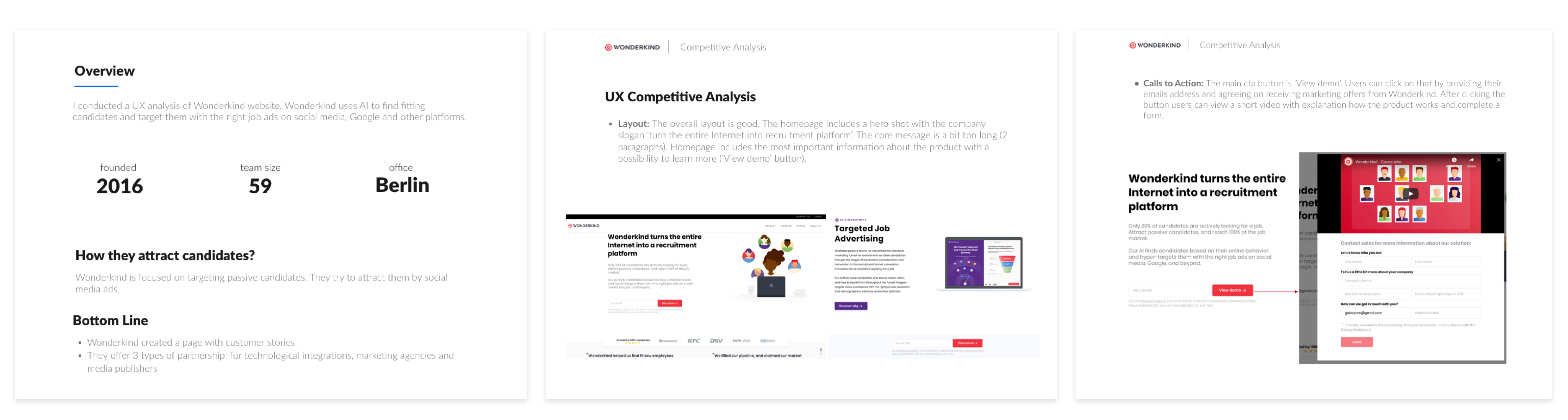
Selected slides from the competitive analysis. Click on the image to zoom in.
User Interviews
Understood recruiters' worklife
I conducted interviews with customers and prospects to understand:
- How different is recruitment based on company size and culture?
- What are the usual tasks of the recruiter during the day?
- Which tasks are enjoyable and which are painful? Why?
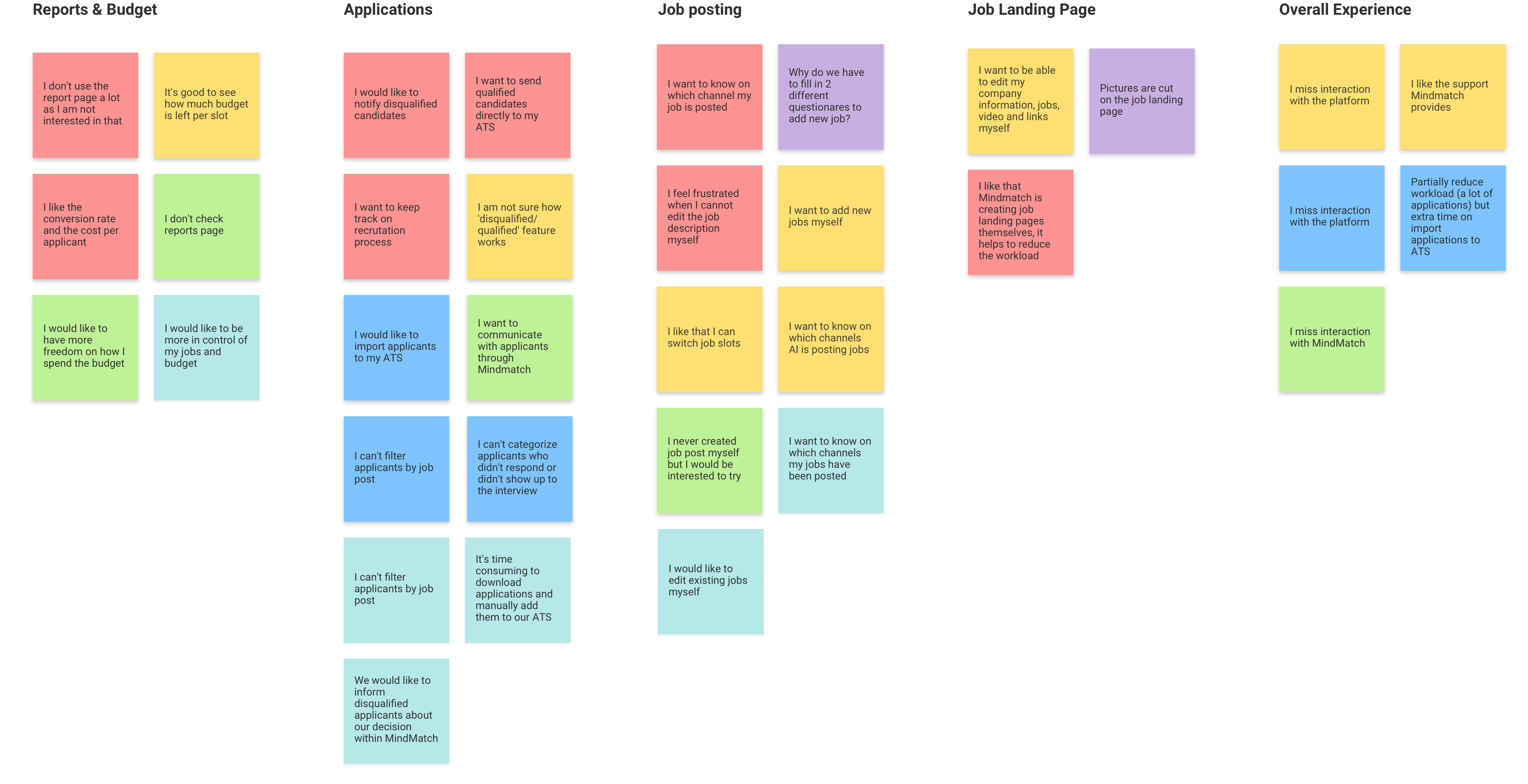
I used affinity mapping to categorize and understand the findings. Click on the image to zoom in.
Key Finding
“I don't want to waste my time by following on applications outside of my Applicant Tracking System.”
— Recruiter, mid-sized company in Germany
Personas
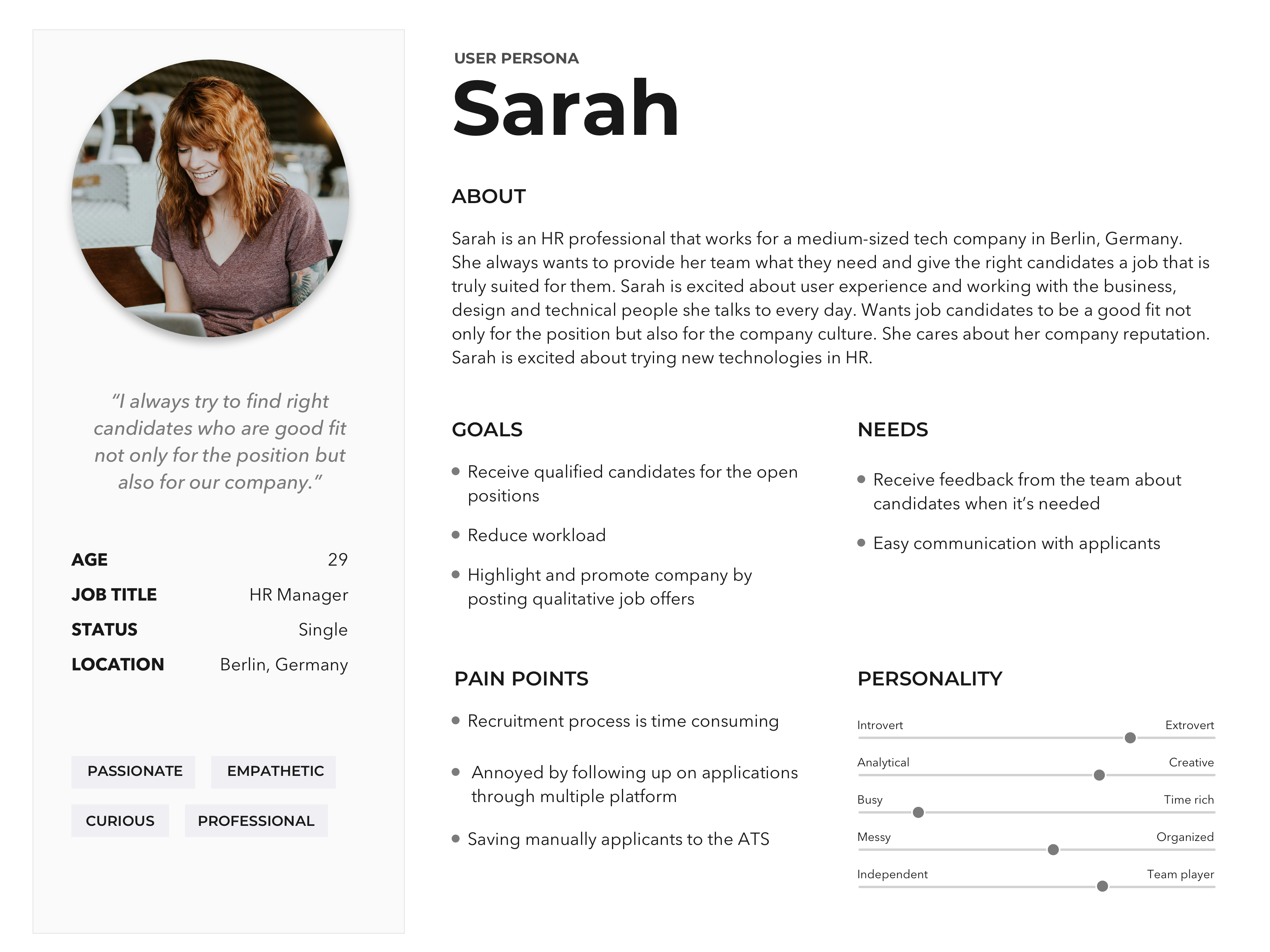
Summarized users’ different motivations and similar needs
Personas creation was an important step that defined how all the research results could help us create a better app. Furthermore, personas were a communication tool between stakeholders and me, ensuring that potential users always have a place within our product regarding design decisions.
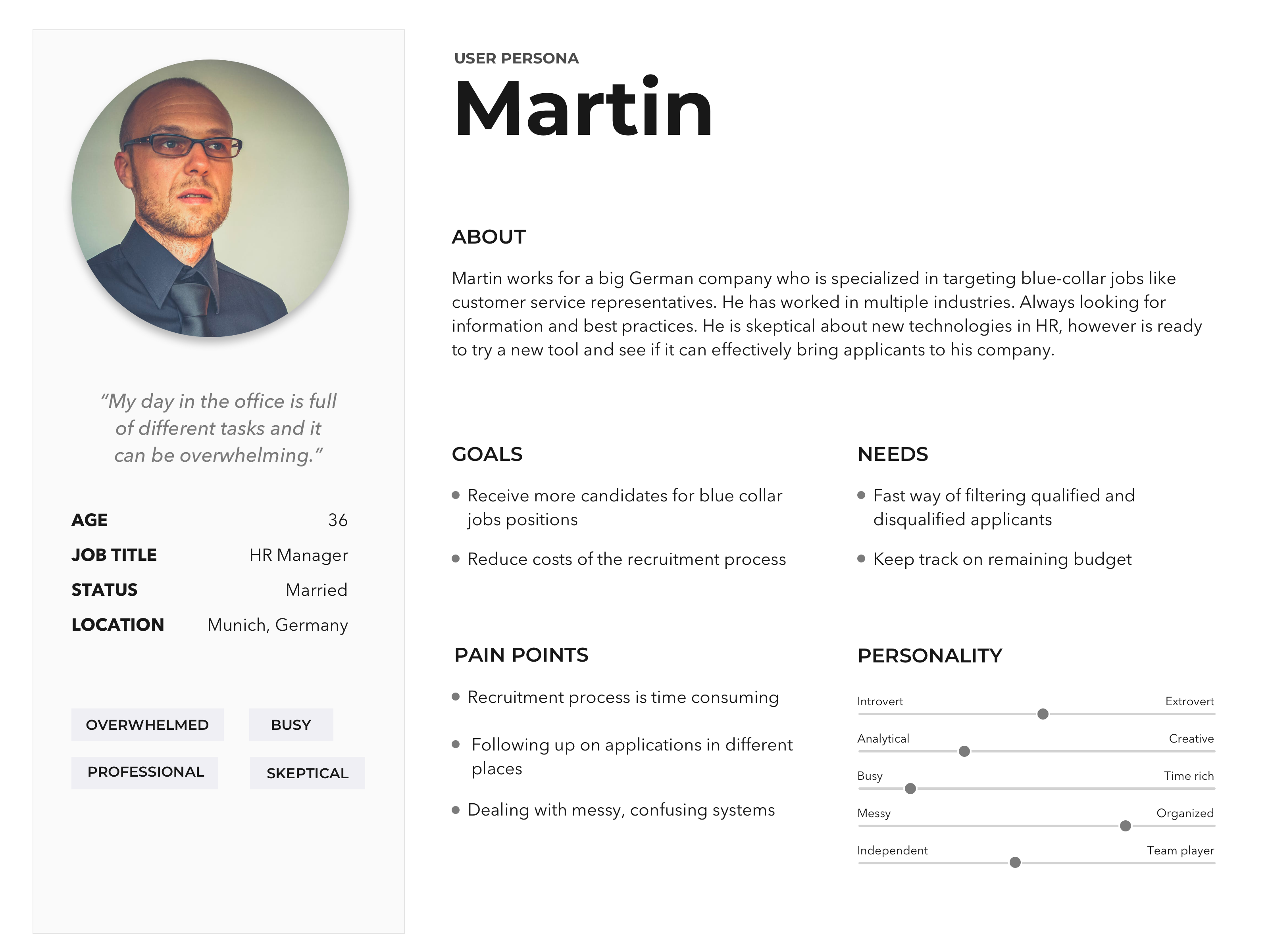
Click on the image to zoom in.
Journey Maps
Discovered underlined opportunities
User journey maps helped capture a user's whole experience during the interaction with MindMatch. Moreover, this step helped to discover underline problems and design opportunities: such as adding transparency on jobs and sending applications directly to ATS.weaknesses in competitors’ user experience and advantages to outperform them.
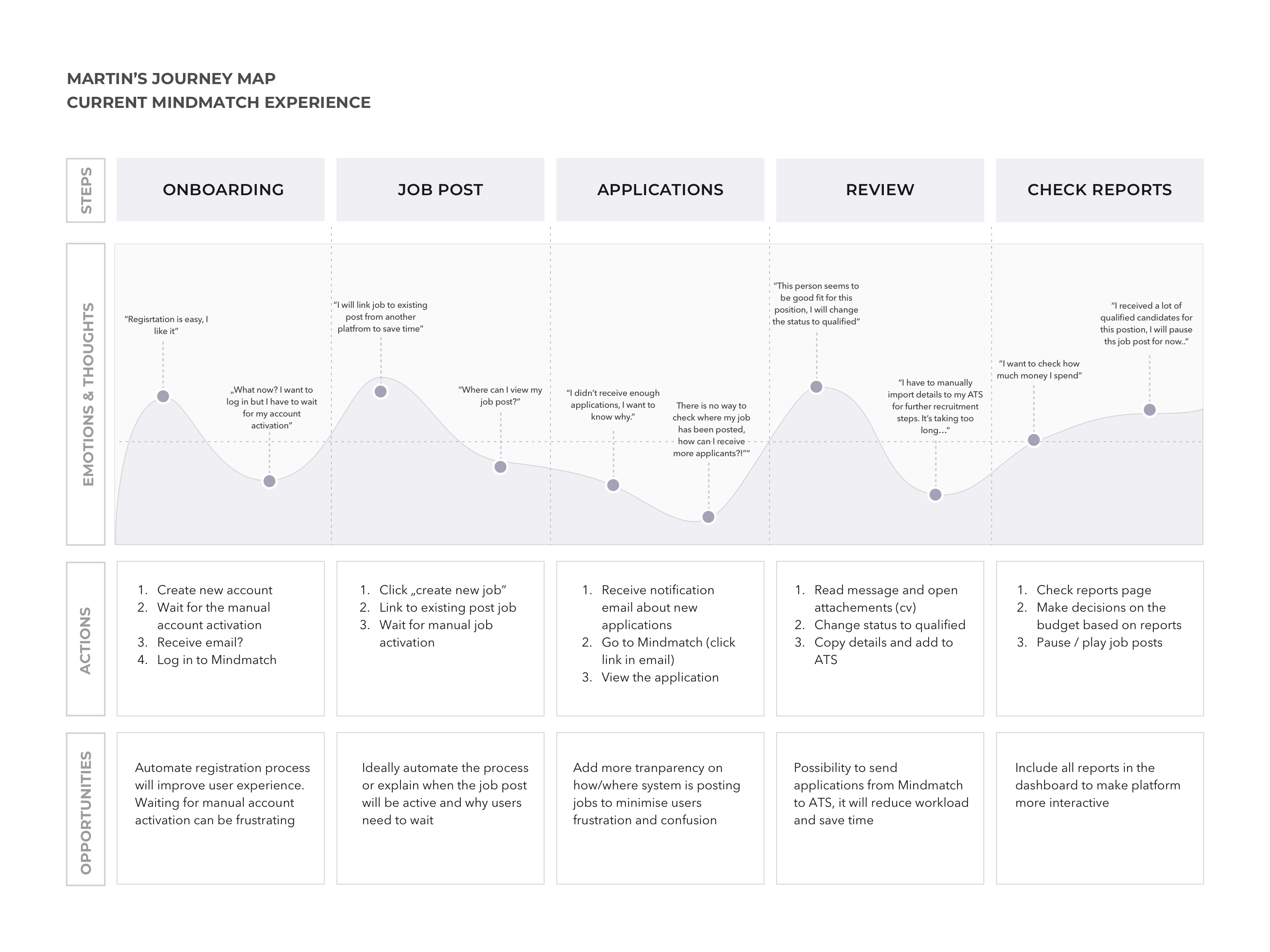
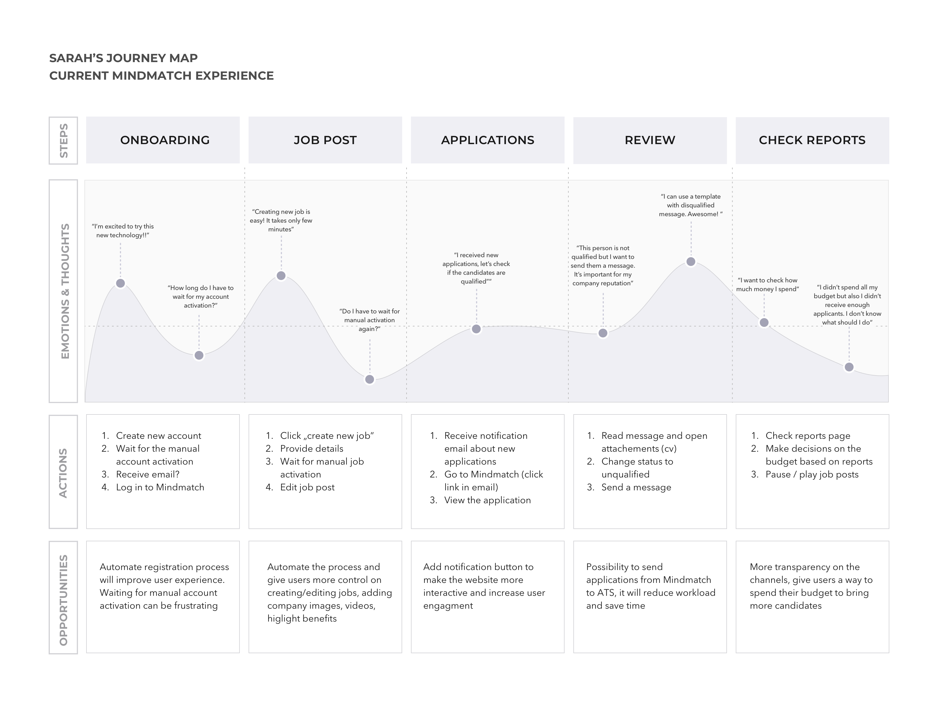
Click on the image to zoom in.
User Flows
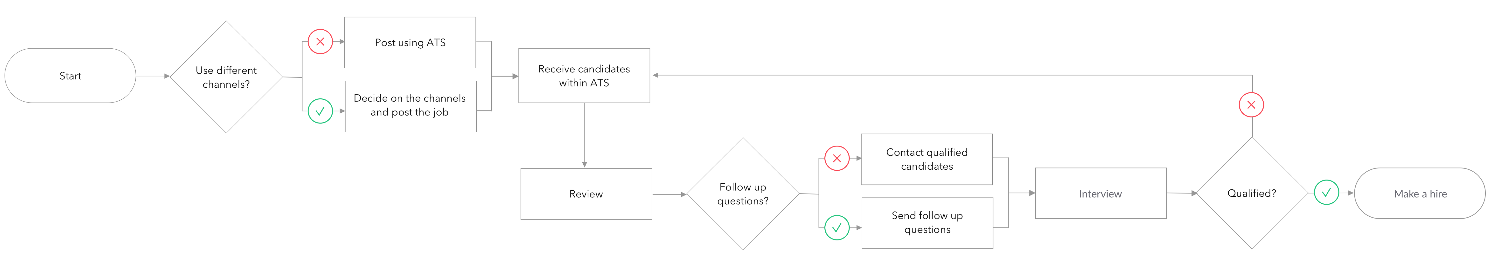
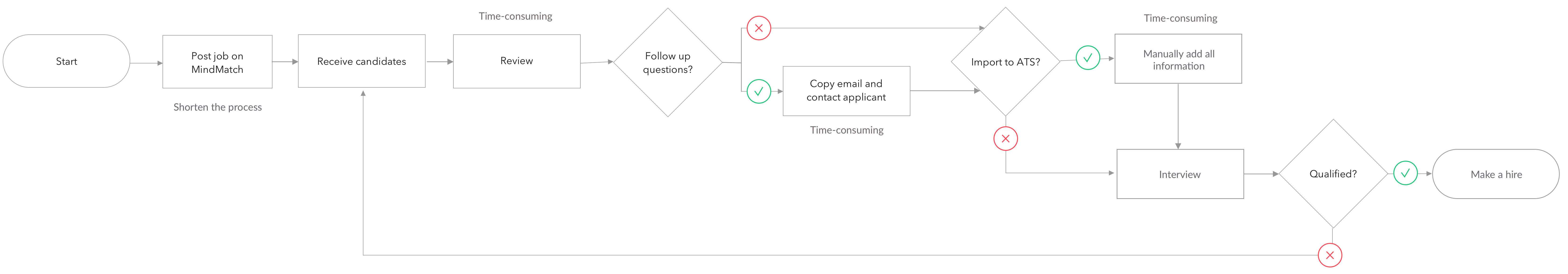
Captured biggest pain point in the current user experience
During the research phase, I discovered the review process is more time-consuming on MindMatch than in the applicant tracking system (ATS). I created user flows to visualize users' steps to review applicants using MindMatch and a regular ATS.
Flow without MindMatch
Flow with MindMatch
Prototyping
& Testing
Explored ideas for ATS integrations
At this stage, I explored and sketched many ideas. I defined the hierarchy of items on screens and communicated what we should test.
Tested the hypothesis
Once I created the prototype of the ATS integration, it came to the user testing phase. I prepared a user testing plan which was a great tool to show business stakeholders how crucial this step is to save costs and test hypotheses before implementation.
The Solution
Designed ATS integration to shorten the process and not disturb the regular recruitment workflow
We implemented a functionality where recruiters can download all applicant information and import it to their own ATS. This solution allows one to decide which applications to send to the ATS, but at the same time, the MindMatch AI matching system learns from recruiters' decisions.
Final design
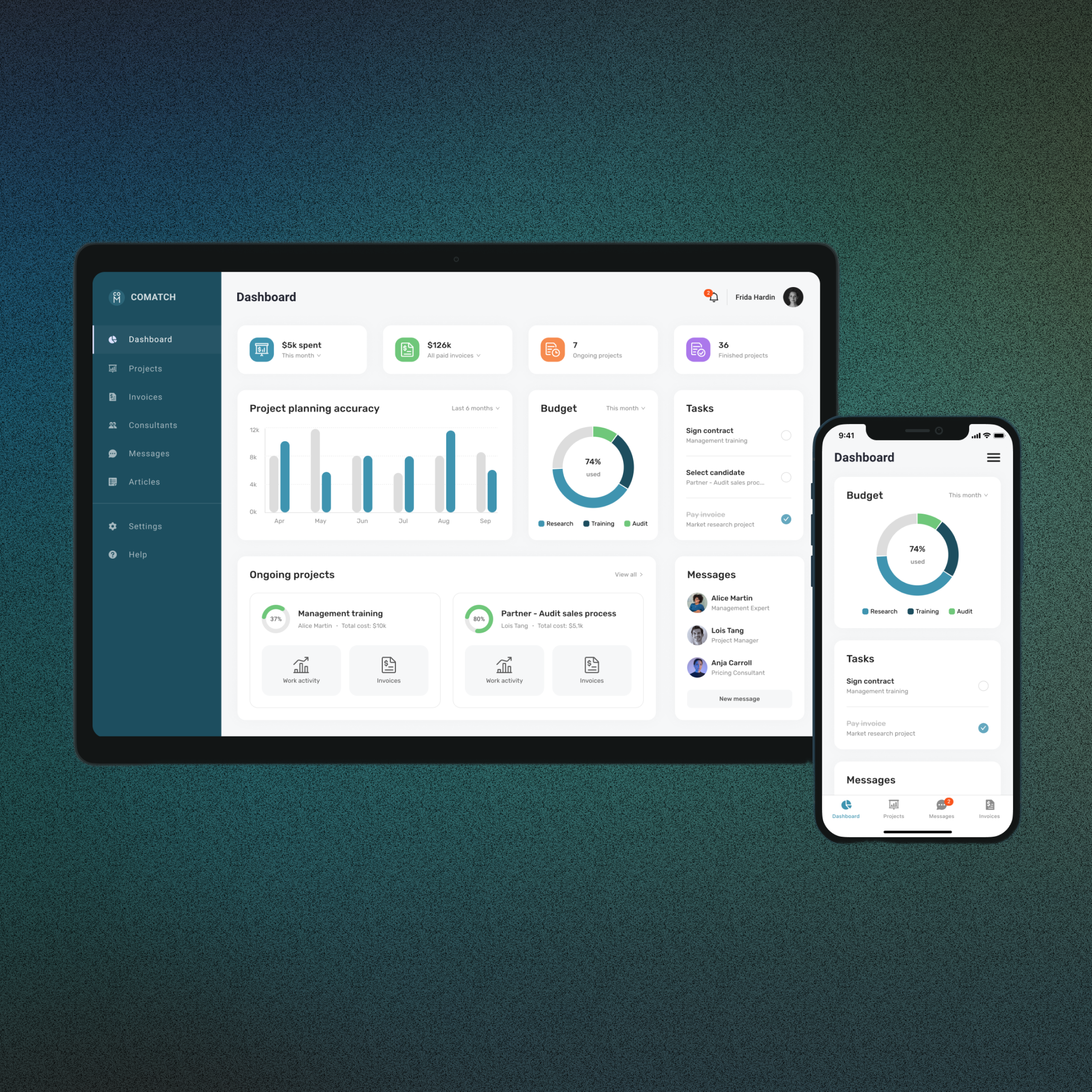
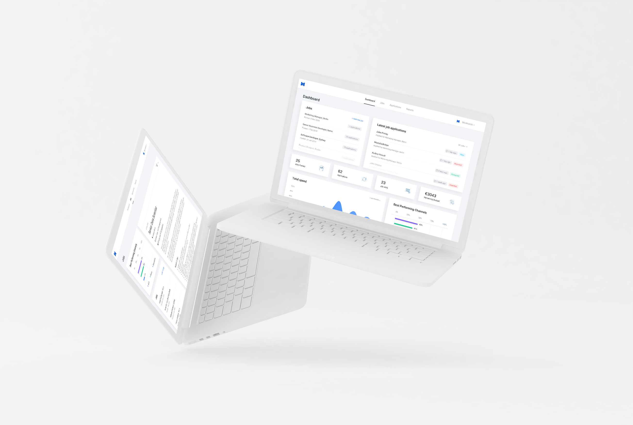
Designed a dashboard
I designed a dashboard with an overview of the key sections like jobs, applications, statistics, and the best-performing channels. The concept, together with design specs, was handed over to software engineers.
Learnings
Showed the design value on the business side
This project showed the MindMatch team how significantly an informative design process could impact the business. The Applicant Tracking System Integration became one of MindMatch's USPs and attracted many new customers.
↑32%
Extended the average session duration. Users interact more with the app.
96%
Positive feedback on the redesigned app from existing customers (based on survey)
↑7%
Increased user retention (repeat visitors; 3+ visits in first 30 days)
More case studies